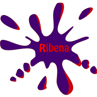
The stages of my logo, original logo
I then created this in fireworks and added this puple splat, and added some read to the sides of the splat. I feel this gave it a bit of extra eye apeal and i think that it makes the logo stand out alot more on the shelf. So over all i think i have succeded in rebranding the logo and making it stand out, i have achieved my target.


No comments:
Post a Comment